


Rebranding a business is a process that is fraught with difficulties. It can be expensive. It can also backfire spectacularly and lead to widespread ridicule.
Standard Life Aberdeen must have been aware of these dangers when earlier this week it unveiled its brave new name and brand logo.
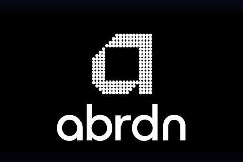
Rather than go down the abbreviation route as the likes of BP and BT have done in the past, the company decided to drop a vowel – namely the letter e – from its name. As a result, Standard Life Aberdeen will henceforth be known as Abrdn – pronounced ‘Aberdeen’, according to the company.
Abrdn reckons the name reflects the fact that it is a “modern, agile, digitally enabled brand” – and it has a new lower-case logo to boot.
The new name was widely mocked on social media, with some wags responding by dropping vowels from words – one person who lives in the Granite City joked: “Does this mean I live in Abrdn now?”
Eye reckons it also looks suspiciously like the adidas brand. No dbt cst a sht ld of mny rgrdlss.


No comments yet